
Draw Attention to What Matters
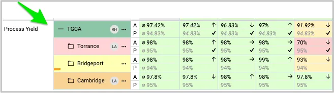
Give your metric dashboards more visual impact with new styling options. You can now use color and different line styles to create clearer distinctions and make important information easier to spot and understand.
Take your formatting further with shading for entire rows or headers, adding more visual hierarchy to your dashboard. All styling options are available in the object settings.
Add Actual vs. Plan to Your Tracking
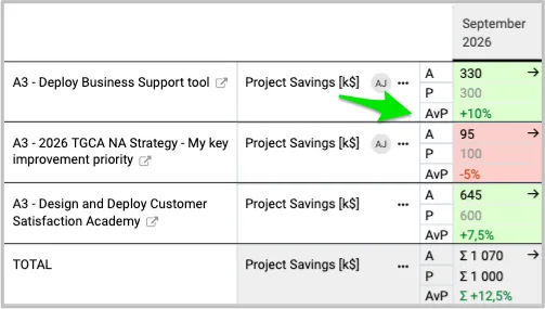
The Actual vs. Plan comparison is now a standard row you can add to any metric dashboard. The calculation is automatic, giving your team a quick and clear view of how actual performance measures up against the plan. Just add the row in your dashboard settings, and you’re ready to go.
Calculate Summary Value Based on the Parent Project
Need a quick view of the bigger picture?
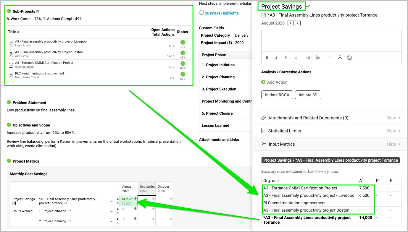
You can now create a summary calculation that automatically pulls values from all sub-projects included in a parent project—both existing and added in the future—and calculates the total for you. Get an instant, consolidated view of your project data without manual calculations or extra effort.
Keep Your Meeting Agenda Moving
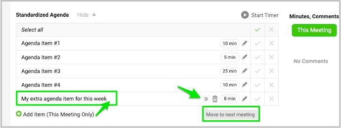
Did your meeting run out of time before you could get to an ad hoc agenda item?
No problem. You can now move the item to your next meeting, so nothing gets lost and your team can pick up right where you left off. Keep your meetings focused, your agenda organized, and important topics on track.
Connect Related Documents to Your Fishbone
Have a related RCCA, dashboard, or other document already in the system?
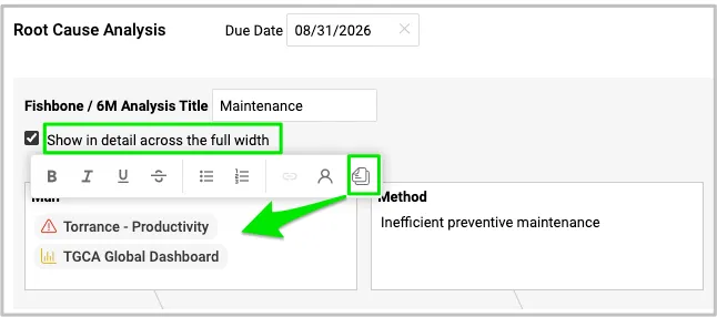
You can now add existing documents with live links directly to your Fishbone analysis, making it easy to bring relevant information together in one place. Share the resources your team needs and keep them readily available as you work through the analysis. You can also display document details in a full-width view, giving your team more space to review the information without leaving the analysis.
Track Quality and Other Issues—Without a Full RCCA
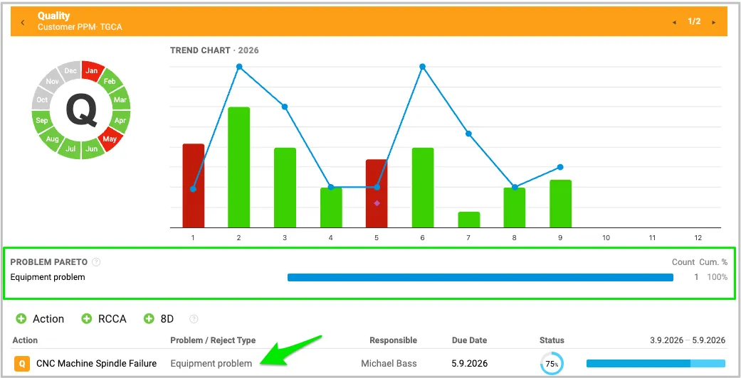
Not every issue requires a full RCCA. If you simply want to track Problem/Reject Types for a specific metric, you can do that too. Just add a Problem/Reject Type to your action and use that information to gain valuable insights.
In your SQDIP chart, you can display a Problem Pareto based on metric-action data while also showing your open actions. And when you need to take it a step further, you can initiate an Action, 8D, or RCCA directly from the report.
About the author

Kate Apking
Customer Success Enthusiast at TeamGuru. Kate works closely with teams using TeamGuru in their day-to-day management and writes about leadership, adoption, and management best practices.