
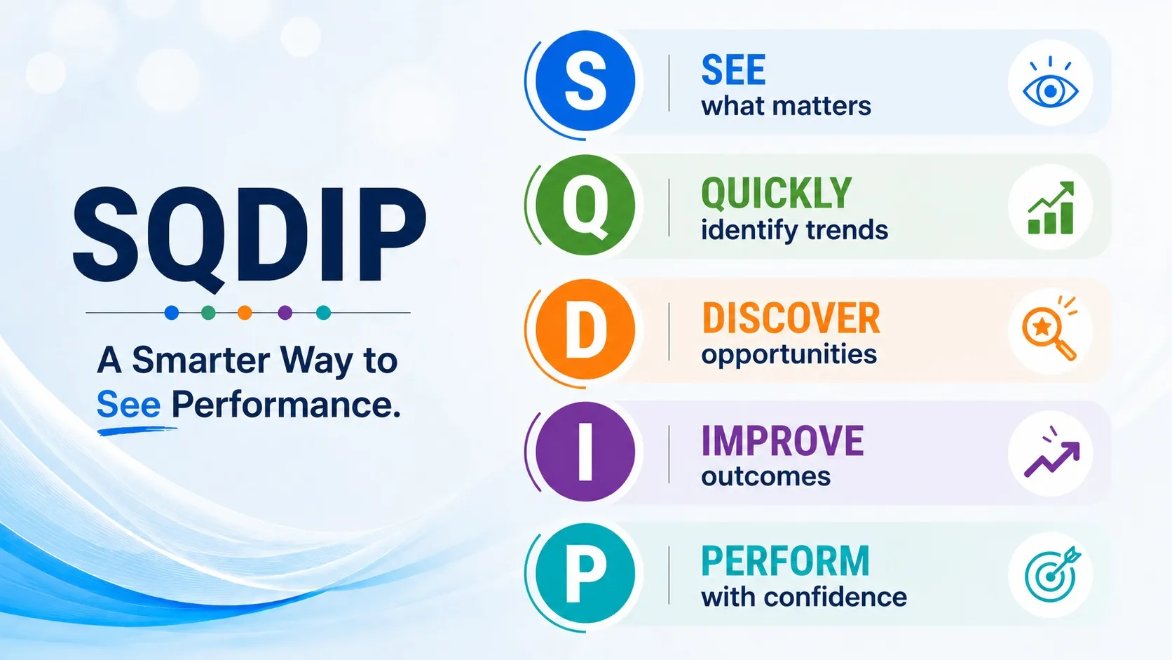
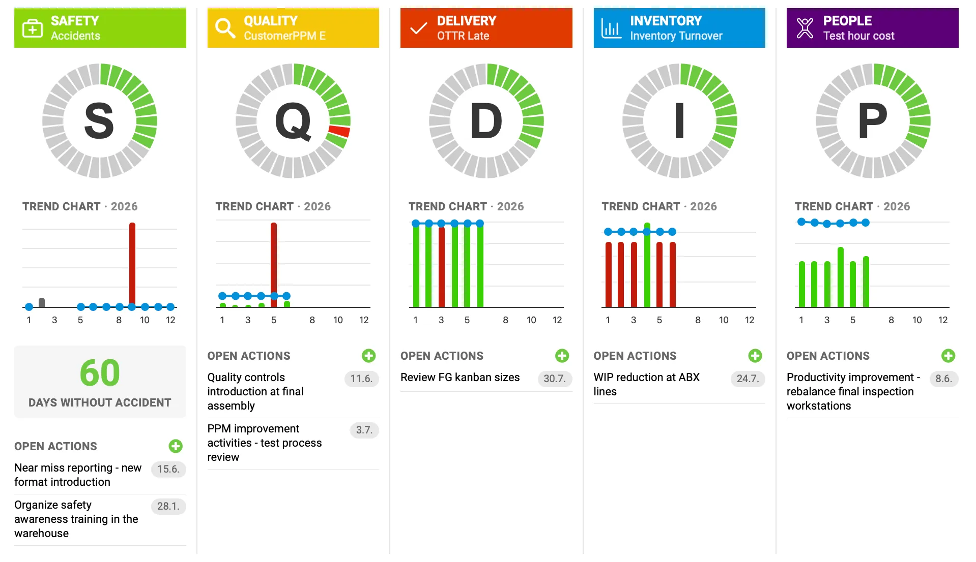
What if your team could spot problems before they impact production, customers, or delivery commitments? SQDIP Charts give you a real-time view of your most important performance areas — Safety, Quality, Delivery, Inventory, and Productivity — helping your team move from simply reviewing data to taking immediate action.
Use SQDIP Charts during your daily meetings to quickly understand what is happening on the floor. Instead of spending time searching through reports, instantly see where performance is on track, where support is needed, and where your team should focus next.
See the Story Behind Your Numbers
Every metric tells a story. SQDIP Charts help you connect the dots between performance, problems, and actions.
For example:
A Safety metric changes from green to red after an increase in near-miss incidents. Your team immediately reviews the details, identifies the cause, and assigns actions before a more serious event occurs.
A Quality metric shows a spike in defects. Instead of waiting for a weekly report, your team drills into the data, identifies the top problem category, and launches a corrective action right away.
A Delivery metric starts trending below target. The team quickly sees the impact, reviews open actions, and adjusts priorities to protect customer commitments.
A Productivity metric shows a decline on one production line. Leaders can compare performance, identify constraints, and focus improvement efforts where they will have the biggest impact.
Make Your Meetings More Powerful
SQDIP Charts bring the right information to the right people at the right time. Use them to:
Quickly identify gaps and opportunities.
Focus discussions on facts instead of assumptions.
Track actions connected directly to performance metrics.
Review progress against targets, plans, and forecasts.
Link related RCCAs and 8Ds to ensure problems are fully addressed.
Give leadership a clear picture of operational performance.
Move From Reaction to Prevention
High-performing teams do not wait for problems to grow — they identify signals early and act quickly. SQDIP Charts turn daily performance data into a visual management tool that helps teams focus, align, and take action.
With customizable charts now available in the system, you can create customizable views that highlight the metrics and insights most important to your team. Make every meeting count and keep driving continuous improvement. Learn more about customizable charts and unlock new ways to visualize your data.
Reviewed by Pavel Humlicek
Co-founder & CEO of TeamGuru, with a background in Lean management consulting. Pavel reviews TeamGuru's management-system and operational-excellence content for practical accuracy and applicability.